
Krzysztof Domaradzki
Graphic Designer / Bak 14
studiokxx.com


English
“I can’t say I miss my earlier days that much but I would rather have the knowledge I have now and be 5 years younger.”
Türkçe
“Geçen günlerimi çok özlediğimi söyleyemem ancak bugünkü bilgim ve birikimimle 5 yıl daha genç olmayı isterdim.”
It's said that childhood is the most significant period in an artist's life. When you look back at those days, what kind of things and memories come to you mind first? What was the main 'color' of your childhood?
Going back to my childhood brings mostly great memories. You see, I come from a pretty large family. I have three brothers, so you can believe me when I say that there was always plenty of funny stuff going on between us and there wasn't too much time for being bored. This might seem a cliche but I guess that my childhood was all about drawing right from the very start. Even though I could always find time for playing football and doing all sorts of other things that little boys do, drawing was always the main thing for me. At the same time, growing up back in the early 80's in Poland wasn't an idyllic experience at all. The communists rule brought the nation to its knees and kept Poles under this terrible regime for more than 50 years. These were sad times, people would disappear mysteriously or get arrested suddenly because of their beliefs. You couldn't buy anything, censorship stifled the press and television, and basically there was nothing to smile about, really. In that sense I think that grey was the dominating color. In the end, however, when I was 11 years old, I was lucky enough to witness the system cave in and Poland was free again. Summing it up, the 'color' of my childhood would have to be a mixture of these two vibes: a cheerful and happy life among my family on the one hand and a dark shadow of totalitarian system on the other.
5 years ago, you didn't have any experience with computers. But now, it's the most important tool in your life. How did that happen so fast? What do you think about the rapid developments in digital technology field and how do you evaluate its future?
You're right. It did happen quite fast. Right after finishing my studies at the Academy of Fine Arts I got a job in an advertisement agency where I was introduced to computers in general. It was a complete mystery to me. I was doing a lot of storyboards back then and some additional graphic design - in other words a lot of crap. Eventually it took me almost a year and a half to realize that this kind of job was not for me - I got totally bored working for very narrow-minded clients and since I knew back than that I wanted much more than that I decided to leave the agency and started to work as a freelancer. I think that was one of the smartest decisions in my life and a great new starting point for me.
A year later, I decided to set up my own business and created studio k. As a one-man enterprise I began by doing book illustrations and then went to designing websites for various clients and agencies. Later on, I started to move closer toward graphic design in general, including branding and identity. The commissions kept on coming, so I asked my wife to help me with project managing - she agreed and now our partnership works for both of us all the way. At the same time, I do know that there is still a lot to learn for me but I think I'm a quick learner and I have plenty of time... I find the technological development almost scary, but I think that as long as I'm able to keep up with it, it's not really that bad. I'm sure that the future belongs to nanotechnology and rapid internet growth in ways are not even able to foresee.
While creating great illustrations and designing cool web sites, you are also very talented in typography field. Creative people involved in typography always look at the world with different eyes. When they see a bad typographic composition, a bad logo or some major mistakes, they feel discomfort. Do you feel that, too? When you think of branding design in all times, which popular logos do you like and dislike most? And finally, if you had a chance, which brand's logo would you choose to redesign?
In the beginning, I thought I wasn't made for typography. No matter how hard I tried it just didn't look right and when I was designing something, adding the letters seemed like the worst part of the process. Later on, however, I discovered that I was more and more tempted by the idea of getting into typing and learning how to really use it. Then, I saw Non-Format works which totally blew me away. I wanted in. Now, I think I might know a bit more about the typography field but I can't say I feel like a champ and I am sure I wouldn't like to lecture anyone on that issue either.
Coming back to your question, yes, I do sometimes feel that a magazine spread or a brochure or a logotype is missing something and I feel discomfort. With regard to the later part of your question, I am not quite sure whether I could name any specific logo that I like or dislike - In my opinion a good logo lasts and the bad one is destined to go through a complete metamorphosis - I think that's the bottom line. I like Nike, I like Apple - these logos are very simple and very clean and that is what I like most about logos in general. I'm not a fan of the new Pepsi logo or the Skoda logo, even though I know that there is a history to it but the green thingy bothers me way too much. Which logo would I redesign, hmm... let me think... maybe Pepsi or MasterCard after it underwent this terrible lifting :)))
In 2006, two years after working for an advertising agency, you founded studiokxx which is a design studio in Poland. Now, you are working in studiokxx and your partner is your wife, Eliza Domaradzka. Working with your wife must be very nice but at the same time, very hard. What kind of difficulties do you face while working together? What kind of duo are you in studiokxx?
The story of studios name can give you an example of how we work together. You see studio k was the first thing that popped into my head when I went to establish the business. Eliza told me later that it sounded like a hairdresser studio's name which made me laugh... she was right! So I decided to modify it when creating a website and since I started to use the kxx nickname at that time it simply became studiokxx. Now, she thinks it sounds like a brothel name... and I'm afraid she's right again... Haha. But seriously though, I think that I cannot overestimate enough how great it is to have somebody like Eliza at my side. She is not only a great wife but she's also really great when it comes to all the client work - she contacts the client, she prepares all the business offers, the invoices and does all the taxes and bank transfers as well as the basic accountancy. Impressive, don't you think? This allows me to focus strictly on the projects and since I'm the only one responsible for all the design work it's a real blessing for me not to have to think about the technical side of the business. It truly helps a lot. And last but not least, I can also count on her expertise when it comes to any finishing touches of an illustration or a project I'm doing - she knows a thing or two about graphic design and she does have a great taste (needless to say:)). That is why she is always the first person to tell me what is wrong.
At the same time, while I'm a workaholic and she likes to take it easy from time to time, it happens sometimes that we struggle over things, see them differently or have a conflict over a client's needs, but I wouldn't consider these to be real difficulties these are the typical marital ups and downs that every couple is bound to face. In my opinion, it's all a matter of the right balance and we seem to have figured it out for now and I hope that the studio's achievements can really show that.
Another talented Polish designer, Peter Jaworowski, whom you worked together for a project with, said that he wished to move from Poland because design field is in a much better condition in some other countries than it's in Poland. Today, he's working for Arsthanea, as its co-founder. What do you think about 'moving abroad'? Have you ever thought about living in another place?
If I had a chance to live and work in the USA or Japan I would probably go for it but in the long run I would definitely miss my closest ones. So I guess that moving abroad for good isn't really an option. Sure, I love to travel but in the end something always drags me back home, where I live and where my family is. I believe that the graphic industry is all about the internet which is nothing more than a huge global exchange platform. The world has shrunk and we should encourage ourselves to use that. I can work for a well-known client without leaving my own house just like I'm doing this interview right now. I agree with Peter when it comes to the analysis of the design field in Poland but you need to remember that Poland was isolated form other countries for almost 50 years and now we have been simply trying to catch up. And I mean fast. Back in the 80's and early 90's it was pretty normal for people to leave Poland in search of better opportunities and higher salaries. Now, as the situation changed one can make it happen right here, that is at least the way I see it. At the same time, it would be really great to buy a small piece of land somewhere in the Mediterranean one day, build a small house and be able to move there as soon as it starts to get cold... I hope that someday I will manage to do that. The thought of being able to swim in the sea all year long would be a dream come true for me. Ha! It's a reason to go on.
Are you interested in movies? Do they inspire you?
Definitely. I have been a huge fan of movies ever since I was a child and saw a great deal of them. I have always had this thing toward moving pictures, books never appealed to me with the same force you know... I remember that it has even been a dream of mine to become a film director one day and somewhere deep inside it still is. Movies do inspire me and my work - my all time favorite classics range from Apocalypse Now, Unforgiven or Amadeus to Star Wars or Bufallo 66 just to name a few. These are the movies that have changed me and the way I perceive things. One should never underestimate the power of a moving picture, - adding the sound and music makes movies the most complete form of art. I'm positive that graphic design has a very important role in the process - I remember watching Se7en for the first time and not being able to close my eyelids right after the film had started - that title sequence by Danny Yount has struck me to the bone and had a huge impact on me as well as the whole movie. God, I thought, how do they do that? I wanted in, too.
Francis Bacon says, 'I will never be an old man. To me, old age is always 15 years older than I am.' What do you think about this statement? Are you afraid of getting old?
He was right. There is definitely something to it. I'm getting close to 30 and at this point I really don't feel like I'm already there. I can't say I miss my earlier days that much but I would rather have the knowledge I have now and be 5 years younger. But you now how it is. If you can't change something there is no reason for fighting it, you just go with the flow and as long as you don't feel old in your heart you know that it's not that bad. Getting old isn't really any of my concern at this point, besides with the intensity of my work I'm expecting to have a heart attack at 35. Who knows, I might start thinking about getting old when I reach 40.
If you had a chance to go back in time and share a famous artist's dining table, who would you choose and what would you talk to him/her?
I would definitely consider Egon Schiele - he was one of my biggest idols back when I was a student. I admired him for his brilliant approach towards nude human figures. Even though he was at first strongly influenced by Gustav Klimt he managed to develop his own style against the classical approach. He had a short and a very decadent life, at some point he was even imprisoned for obscenity. He would definitely make a good company since above all that talent and great, very inspirational themes, he was also a heavy smoker just like me. I would probably like to talk with him about modern art and things that he couldn't have imagined then that are now. I wonder what he would say about selling an artist's shit, wrapping up buildings and stuff like that... But there are also many other famous artists I would love to dine with, if possible: Albrecht Durer, Matthias Grunewald, Jacek Malczewski, Chaim Soutine, Francis Bacon, Anselm Kiefer - these are all my gods, my private heroes, whether dead or alive, I cannot thank them enough for giving me what they did. They are all huge.
Theme of our current issue is '2'. What does this word mean to you?
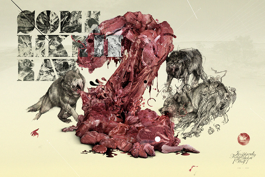
Number 2 can represent many things. I can surely think of two people for example and their relationship or two of my brothers or my two hands... But the piece I did for your magazine is something else. Very recently when I was trying to think of something that would be a good answer to the theme of your magazine I got my hands on a design book called Japan Graphics 2. While I was looking through the book, I found a piece by Keigo Mohri entitled Wolf which really inspired me. I wanted it to represent the duality of my approach towards graphic design and illustration in general. That is the combination of the traditional and the digital. The wolves are hand-drawn using three different traditional techniques and are trying to devour a large number 2 made out of raw, blood-dripping meat which is made by using the Photoshop. In a way, that's how I work. Both of these extremities: a pen and a computer mouse fight over an illustration's motif. Usually, I keep on adding a lot of things like the type and some other stuff flying around just like I did here but in the end the main motif is the number 2, just like that. Speaking about it makes me wonder if that's such a good idea after all but I will let you be the judge...
Çocukluk yıllarının bir sanatçının yaşamındaki en önemli dönem olduğu söylenir. Geriye dönüp baktığınızda o yıllarla ilgili ne tür şeyler aklınıza geliyor, gözünüzde ne tür anılar canlanıyor? Çocukluğunuzun bir rengi olsaydı, ne olurdu?
Çocukluğuma geri döndüğümde çoğunlukla güzel şeyler aklıma geliyor. Gördüğünüz gibi oldukça büyük bir aileden geliyorum. Üç erkek kardeşim olduğu için daima onlarla yapacak eğlenceli şeyler bulabiliyordum. Sıkılmak için yeterince zamanımız bile olmuyordu. Bu belki biraz alışılagelmiş bir ifade olacak ama, çocuklukla ilgili en önemli şey, en erken yaşlardan başlayarak 'çizim yapmaktır'. Her ne kadar küçük bir çocuğun yaptığı her şeyi yapmış, sokaklarda futbol oynamış olsam da çizim yapmak benim için her şeyden önce gelirdi.
Bu arada 80'lerin başlarında Polonya'da çocuk olmak, pek de sakin ve huzurlu bir deneyim değildir. Komünist hükümet, ülkeyi dizleri üzerine çökertmiş, 50 yılı aşkın bir süreyle bu korkunç rejime maruz bırakmıştır. Üzücü dönemler... İnsanların gizemli biçimde ortadan kaybolduğu, inançları yüzünden ansızın tutuklandıkları... Hiçbir şey satın alamadığınız, sansürün basını ve televizyonları hareketsiz bıraktığı, temel olarak gülümseme nedeni olabilecek hiçbir şeyin kalmadığı yıllar... Bu nedenle sanırım çocukluğumun rengi 'gri'ydi diyebilirim.
Neyse ki, 11 yaşımdayken Polonya'nın yeniden özgürlüğüne kavuştuğuna tanıklık edebildim. Sonuç itibariyle çocukluğumun rengini, şu iki ifadenin karışımı olarak değerlendirebilirim; ailemle birlikte geçirdiğim güleryüzlü ve mutlu bir yaşam ve totaliter sistemin karanlık gölgesi...
5 yıl önce bilgisayarlarla ilgili hiçbir deneyiminiz yoktu. Ancak şimdi hayatınızdaki en önemli araç haline geldi. Bu değişim nasıl bu kadar hızlı oldu? Dijital teknoloji alanındaki başdöndürücü hızda gelişmeleri ve bu alanın geleceğini nasıl değerlendiriyorsunuz?
Evet haklısınız. Gerçekten çok hızlı oldu. Güzel Sanatlar Akademisi'ndeki eğitimimi tamamlar tamamlamaz bir reklam ajansında işe girdim. Bilgisayarla da burada tanışmış oldum. Benim için tam bir gizemdi. Öncesinde bir sürü öykü çizimi (storyboard) yapıyor, bazen de 'boş işler' diyebileceğim grafik tasarım çalışmaları yapıyordum. Sonuçta 1,5 yıl içinde bu işin pek de bana göre olmadığını anladım. Dar düşünceli müşterilerle çalışmaktan çok sıkılmıştım ve kariyerime serbest olarak devam etmemin daha doğru olacağına karar verdim. Sanırım hayatımda verdiğim en akıllıca kararlardan biriydi. Ve tabii harika bir başlangıç noktası...
Bir yıl sonra kendi işimi oluşturma noktasına geldim ve Studio K'yı kurdum. Bir 'tek adam girişimi' olarak başlayan stüdyoda kitap illüstrasyonları yapıyordum. Ardından birçok müşteri ve ajans için web siteleri tasarlamaya başladım. İlerleyen zamanda genel grafik tasarım ve kurum kimliği çalışmalarına da el attım. Siparişlerin sayısı ve geliş sıklığı artınca, eşime, proje yönetimi konusunda bana yardımcı olması için teklifte bulundum. Anlaştık ve şimdi stüdyodaki çalışmalarımızı iki ortak olarak sürdürüyoruz.
Tabii bu arada öğrenmem gereken birçok şey olduğunu da biliyorum. Ancak hızlı öğrenen biriyim ve yeterince de zamanım var. Teknolojik gelişmeleri büyük ölçüde ürkütücü buluyorum, ancak ayak uydurabildiğim sürece pek de sorun yarattığını düşünmüyorum. Geleceğin; nanoteknolojiye ve öngörmenin bile mümkün olamayacağı ölçüde hızlı büyüyecek olan internete ait olacağı inancındayım.
Yaptığınız güçlü illüstrasyonların ve birbirinden şık web sitelerinin yanında, tipografi alanında da çok değerli işler ortaya koyduğunuzu görüyoruz. Tipografiyle iç içe olan yaratıcı insanların, dünyaya farklı gözlerle baktıklarını biliriz. Kötü bir tipografik yerleşim, çirkin bir logo, ya da hatalı bir uygulama gördüklerinde rahatsızlık duyarlar. Siz de bu duyguyu yaşıyor musunuz? Tüm zamanların marka kimliklerini hızlıca düşündüğünüzde hangi popüler logoları en çok sevip, hangilerinden tam anlamıyla nefret ettiğinizi bizimle paylaşır mısınız? Ve son olarak, bir şansınız olsaydı, hangi markanın logosunu yeniden tasarlamak isterdiniz?
Başlarda tipografi için yaratılmadığımı düşünürdüm. Ne kadar çok çalışırsam çalışayım doğru olmazdı ve bu yüzden tasarım yaparken işin en kötü kısmı yazının yerleştirilme aşaması gibi gelirdi. Ancak daha sonra, iyi yazı yerleşimleriyle ve iyi tipografiyle ne kadar da ilgili olduğumu keşfedip öğrenme sürecimi hızlandırmaya karar verdim ve Non-Format'ın aklımı başımdan alan işleriyle karşılaştım. Şu an tipografi hakkında daha çok şey bildiğimi söyleyebilirim, ancak yine de kendimi zirvesinde gibi hissetmiyorum. Kimseye tipografi alanında ders verebilecek durumda değilim.
Sorunuza geri dönecek olursam, evet, bazen bir dergide, broşürde, ya da bir logoda eksik bir şey gördüğümde rahatsızlık hissediyorum. Sevdiğim ya da hiç sevmediğim bir logonun ismini verebilir miyim bilmiyorum ama şunu söyleyebilirim ki, iyi bir logo, uzun süre varlığını sürdürebilen logodur. Kötüsü ise kaçınılmaz bir biçimde değişime zorlanacak olandır. Sanırım işin özeti bu. Ben Nike'ı, Apple'ı seviyorum. Bunlar son derece temiz ve sade işler. Yani benim bir logoda olması gerektiğini düşündüğüm özelliklere sahipler. Pepsi'nin yeni logosunu sevmiyorum, Skoda'nınkini de tuttuğumu söyleyemem. Belli bir geçmişleri olduğunu bilsem de şu yeşil şey beni epeyce rahatsız ediyor.
Hangi logoyu yeniden tasarlamak isterdim... Hmm... Biraz düşüneyim... Sanırım Pepsi ya da MasterCard diyeceğim.
Bir reklam ajansında iki yıl çalıştıktan sonra, 2006'da kendi stüdyonuz studiokxx'i kurdunuz. Bugün, Polonya'da, eşiniz ve ortağınız Eliza Domaradzka ile birlikte studiokxx için çalışıyorsunuz. İnsanın eşiyle ortak olması hem çok güzel, hem de bir o kadar zor olmalı. Siz ne tür zorluklar yaşıyorsunuz? Studiokxx'te nasıl bir ikili oluşturuyorsunuz?
Stüdyonun adının arkasındaki hikaye bile tek başına nasıl çalıştığımızın örneği olabilir. İşi kurduğumda ilk aklıma gelen isim Studio K idi. Eliza bana bu ismin kuaför ismini andırdığını söyledi. Beni çok güldürdü ama çok da haklıydı. İsmi değiştirmeye karar verdim ve o sıralar kullanmaya başladığım kxx takma adını stüdyonun adına ekleyerek studiokxx'i oluşturdum. Eliza şimdiki ismin de genel evi andırdığını söylüyor. Ve korkarım yine haklı :) Ancak şaka bir yana, Eliza gibi birine sahip olmanın ne kadar müthiş bir şey olduğunu kelimelerle ifade edemiyorum. O sadece harika bir eş değil, aynı zamanda müthiş de bir çalışan. Müşteriyle görüşüyor, tüm teklifleri o oluşturuyor, faturaları o düzenliyor, vergileri, para transferlerini, her şeyi o yapıyor. Sizce de etkileyici değil mi?
Onun varlığı, benim doğrudan işlere odaklanabilmemi sağlıyor. Tüm tasarım çalışmalarından tek sorumlu kişi de ben olduğumdan, teknik konularla ilgilenmek zorunda kalmamak benim için büyük bir avantaj teşkil ediyor. Ayrıca Eliza, grafik tasarım konusunda bir iki şey biliyor olmasına rağmen harika bir zevki ve güçlü bir deneyimi var. Bu yüzden de beni, yaptığım bir şeyin yanlış olduğu konusunda ilk uyaran kişi o oluyor.
Tabii bunun dışında benim tam bir işkolik olduğum, onun da bazı şeyleri basitçe halletmek istediği zamanlarda bazı tartışmalarımız ve farklı düşüncelerimizden kaynaklanan atışmalarımız olabiliyor. Ancak bunları ciddi zorluklar olarak görmüyorum. Her çiftin yaşamasının gayet normal olduğu şeyler bunlar. Bence bütün olay dengeyi kurabilmekte. Bizim de bunu başardığımızı düşünüyorum. Stüdyonun başarıları da bunun bir kanıtı niteliğinde...
Dergimizin eski konuklarından Polonyalı tasarımcı Peter Jaworowski ile bir projede birlikte çalıştınız. Jaworowski, röportajımızda Polonya'dan taşınmak istediğini söylemiş, bunun nedeni olarak da başka ülkelerde tasarım alanının daha ileri seviyede olduğu fikrini ortaya koymuştu. Bugün, kendi kurduğu Arsthanea'da çalışıyor. Siz yurtdışına taşınma konusunu nasıl görüyorsunuz? Polonya'dan başka bir yerde yaşamayı düşündünüz mü?
Amerika veya Japonya'da yaşama ve çalışma şansım olsaydı gitmek isteyebilirdim. Ancak uzun koşuda yakınlarımı çok özlerdim. Yani bence bu tür şeyler için yurtdışına gitmek ciddi bir seçenek değil. Seyahat etmeyi tabii ki çok seviyorum ama sonunda bir şeyler beni eve, ailemin ve sevdiklerimin yaşadığı yere geri getiriyor. Bence grafik tasarım sektörü artık tamamen dev bir küresel değişim platformu olan internetle yürüyor. Dünya gittikçe küçülüyor. Bizim de bunu kullanmak için kendimizi cesaretlendirmemiz gerekiyor.
Bugün, evimden hiç çıkmadan dünyaca ünlü bir müşteriyle çalışabilirim, tıpkı şu anda bu röportajı yapıyor olduğumuz gibi. Konu, Polonya'daki tasarım çevresine geldiğinde Peter'ın söylediklerine katılıyorum. Ancak şu da unutulmamalı ki, Polonya yaklaşık 50 yıl boyunca diğer ülkelerden izole olmuş biçimde yaşadı. Şimdilerde yeniden eski gücünü yakalamaya çalışıyor. Ve gerçekten oldukça da hızlı yol alıyor... 80'lerde ve 90'ların başında, insanların daha iyi çalışma şartları ve daha yüksek maaşlar için Polonya'dan ayrılmaları alışıldık bir şeydi. Şimdi ise insanlar burada da iyi şeyler yapabiliyorlar. En azından benim gözlemim bunu gösteriyor.
Bu arada şunu da düşünmeden edemiyorum, bir gün, Akdeniz'de, herhangi bir yerde küçük bir arsa alıp, üzerine küçük bir ev yapıp, havalar soğuduğunda oraya taşınmak harika olabilirdi. Umarım günün birinde bunu gerçekleştirebilirim. Bütün yıl boyunca denizde yüzebilme fırsatı benim için gerçeğe dönüşmüş bir rüya gibi olurdu :)
Sinemayla ilgileniyor musunuz? Filmler size ilham veriyor mu?
Kesinlikle. Çocukluğumdan beri gerçek bir sinema hayranıyım. Hareketli resimler beni her zaman etkilemiştir. Kitaplardan ise hiçbir zaman aynı tadı alamamışımdır. Eskiden bir film yönetmeni olmayı bile hayal ediyordum. Hala da içimde bir yerlerde bu istek durur. Filmler hem beni, hem de işlerimi etkiliyor. En büyük favorilerimden birkaçını saymam gerekirse; Apocalypse Now, Unforgiven, Amadeus, Star Wars ve Bufallo 66 diyebilirim. Bunlar beni ve olayları algılama biçimimi değiştiren filmlerdir. Kimse bir filmin gücünü küçümsememeli. Sesin ve müziğin de eklenmesiyle filmler, sanatın en tamamlanmış biçimlerine dönüşüyorlar. Bence grafik tasarımın da bu süreçteki rolü oldukça önemli.
Se7en filmini ilk izlediğim anı hatırlıyorum da, başladığı andan itibaren göz kapaklarımı bir an olsun kapatamamıştım. Danny Yount'un yaptığı o giriş canlandırması beni iliklerime kadar etkilemişti. 'Tanrım' dedim kendi kendime, 'Bunu nasıl yapabilirler! Ben de istiyorum!'.
Francis Bacon şöyle diyor; 'Ben hiçbir zaman yaşlı bir adam olmayacağım. Benim için yaşlı insan, her zaman benden 15 yaş büyük insandır.' Bu söz hakkında ne düşünüyorsunuz? Yaşlanmaktan korkar mısınız?
Bence haklıydı. 30 yaşıma yaklaşıyorum ve gerçekten bu yaşta olduğumu hissetmiyorum. Geçen günlerimi çok özlediğimi söyleyemem ancak bugünkü bilgim ve birikimimle 5 yıl daha genç olmayı isterdim. Ama işlerin nasıl yürüdüğünü bilirsiniz. Eğer bir şeyleri değiştiremiyorsanız onun için savaşmanız anlamsızdır. Sadece akışına bırakmalısınız. Kendinizi yaşlı hissetmedikten sonra durum pek de o kadar kötü değildir.
Yaşlanma konusu şu an gündemimde olan bir şey değil tabii. Ayrıca işlerimin aşırı yoğunluğunu görünce 35 yaşımda kalp krizi geçireceğimi de öngörebilirim. Kim bilir, belki de yaşlılığı 40'ıma ulaştığımda düşünmeye başlarım.
Bir zaman yolculuğuna çıkma şansınız olsaydı, geçmişe gidip hangi ünlü sanatçıyla birlikte akşam yemeği yemek isterdiniz? Kimi seçer ve ona öncelikle neler söylerdiniz?
Kesinlikle Egon Schiele'yi isterdim. Öğrencilik yıllarımdan beri en büyük idollerimden biridir. Çıplak insan figürleri üzerindeki uygulamalarına hayrandım. İlk başta Gustav Klimt'ten fazlasıyla etkilenmiş olsa da, sonradan klasik anlayışın karşısında duran kendi tarzını geliştirmeyi başarmış. Oldukça kısa ve çöküntülü bir hayat yaşamış. Bazı dönemlerde müstehcenlik konusuna hapsolmuş. İlham veren konuları, yeteneği ve üstünlüğünün yanısıra, tam benim gibi gerçek bir sigara tiryakisiymiş.
Sanırım onunla, modern sanatı ve gerçekleşeceğini asla düşünmediği ama benim deneyimlemiş olduğum şeyleri konuşurdum. Bir sanatçının dışkısını satmasını, binaları kıvırmasını ve bunun gibi şeyleri nasıl yorumlardı merak ediyorum.
Tabi Egon Schiele dışında da sayabileceğim birçok sanatçı var. Albrecht Durer, Matthias Grunewald, Jacek Malczewski, Chaim Soutine, Francis Bacon, Anselm Kiefer, ... Keşke mümkün olabilseydi. Bunlar benim tanrılarım, özel kahramanlarım. Yaşıyor da olsalar, ölmüş de olsalar, onlara bana verdikleri şeyler için yeterince teşekkür etmenin bir yolunu bulamam. Gerçekten çok büyükler.
Bak Dergisi'nin 14. sayısının konusu '2'. Bu sözcük size neyi ifade ediyor?
2, birçok şeyi temsil edebilir. İki insanı ve onların ilişkilerini düşündürebilir. İki erkek kardeşimi, iki elimi... Ancak derginiz için yaptığım şey tamamen farklı. Kısa süre önce, derginizin konusu için iyi bir yanıt olabilecek şeyi düşünmeye çalışırken elim Japon Grafikleri 2 adlı bir kitaba gitti. Sayfalarını karıştırırken Keigo Mohri'nin Wolf (Kurt) adlı çalışmasına rastladım ve çok etkilendim. Onun, hem grafik tasarım hem de illüstrasyon alanındaki girişimlerimin ikiliğini temsil etmesini istedim. Geleneksel ve dijitalin birleşimini... Üç ayrı geleneksel teknikle, elle çizilmiş olan kurtlar, Photoshop'la yapılmış, çiğ ve kanlı bir etin oluşturduğu 2 sayısını yiyorlardı. Bir açıdan, bu benim çalışma tarzımı gösteriyor. İki uç nokta, kalem ve bilgisayar faresi, illüstrasyonun karakteri için savaşıyorlar. Genellikle yazı veya diğer grafik öğelerini işlerime eklemeye sürekli devam ederim, bu işte de olduğu gibi, ancak sonunda görüyorsunuz ki asıl fikir hala '2'dir. Üzerinde konuşunca yeterince iyi bir fikir mi bilemedim. Kararı siz vereceksiniz...
Fikriniz ne olursa olsun, bana bu fırsatı verdiğiniz ve benimle bu röportajı yaptığınız için teşekkür ederim.