
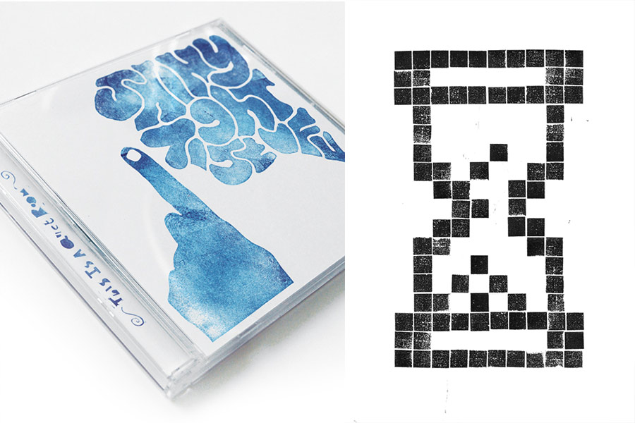
Craig Ward
Graphic Designer / Bak 11
www.wordsarepictures.co.uk
English
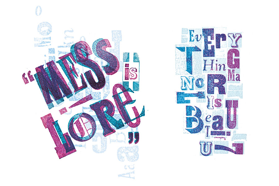
“Future is one of my best friends. We can go anywhere together and he’s good at most things. He’s straight up, honest, dresses well, especially now he’s put on a bit of weight and he always knows how to turn on the style.”
Türkçe
“Futura benim en iyi arkadaşlarımdan biri. Her yere birlikte gidebiliriz. Birçok işte çok başarılıdır. Doğru ve dürüsttür, iyi giyinir, özellikle şimdilerde hafif kilo aldı. Her zaman kendini nasıl şık göstereceğini iyi bilir.”
Would you please tell us about your workspace? What does it look like? Are there any objects that you can't do without on your table?
I work very organically, letting the idea take itself in whichever direction seems appropriate and I also work in a variety of mediums so my workspace is a constantly evolving, undefined area. I might work in my home, a friend’s studio or the offices of the advertising agency where I work as a designer and art director. One day I might be working on my living room table with my Adana printing press and type collection, a week later it might be covered in shavings from a lino cut or I might have set up my laptop, scanner and digital camera and turned it into a micro studio.
The one common denominator throughout, regardless of where I work (cups of coffee notwithstanding) is a sketchbook: it’s where every project starts - commissioned or personal, live or speculative - and no matter how crude it might seem hurriedly scribbled on the page, I always keep it there with me while to refer back to while I’m working so as not to lose the original sentiment.
As a city full of graphic design and beautiful typography, does London inspire you? If you have to move from there, where would you choose to go?
It’s impossible not to be inspired by London. Growing up, I lived in a small rural village in Lincolnshire in the East of England where the nearest McDonalds was about 30 miles away. Not that that’s a bad thing but I’m just trying to qualify how remote it was, and London really did seem like another world. No-one I knew lived down there or even wanted to (we called it The Smoke) but I’ve always had this love affair with the place – the allure of the unknown, the tall buildings, the opportunities it presented, the expensive houses and the hustle and bustle. Even before I knew I was going to be a designer I wanted to be here.
It’s a city so steeped in heritage and history that you can’t help but be drawn in by it. I walk the same way to work most mornings and there are still details on buildings that I haven’t noticed before and just knowing I’m there makes me smile. Walking past The National Gallery, through the Theatre district, past The Ivy, hearing 15 different languages in the space of 100 yards: it makes me feel at once so completely unimportant and anonymous but at the same time so glad to be here and to be enjoying the place while I’m young. It inspires at every turn and as England’s creative hub it’s somewhere I feel I can’t afford not to be.
Whilst there’s a part of me that would one day like to get back to the countryside (which can be as inspiring as the city but in different ways), I’ve had a similar crush on New York since I was a child, which is somewhere I’d love to spend some time working if the opportunity arose. It really is the world in a city and while I’ve only spent a short amount of time there, some of the experiences you can have, the sights you see, the people you meet and the vibe you get are all exclusive to it.
"Each letter should have a flirtation with the one next to it" says Mac Baumwell. In your opinion, what qualities make a typographic composition good enough?
Unlike most other creative pursuits there are a lot of rules that you can choose to follow when working with type. In doing so you’ll create something that is considered ‘right’ by the wider typographic community: there will be a grid; things will line up; if you’re working with body copy you shouldn’t have more than 15 words per line and so on and so forth. Of course, you’ll run the risk of creating something that’s been done countless times before. The best typography acknowledges the rules and work that has been done before and decides how to interpret it and to what extent to follow it’s lead.
On a personal level, one thing that unites all good typography is scale and contrast. Some people are afraid of using type above 12pt and hide it away in the bottom left corner of a page – what I try to do is the opposite; to celebrate the type. As soon as you enlarge type it becomes something else – more than just a series of letters. It becomes a shape or a set of curves – something abstract; it takes on a gender and a character and the craftsmanship of the type designer really comes to the fore.
Imagine that Helvetica, Frutiger, Futura, Optima and Bodoni are five different people in a neighborhood. What kind of guys would they be? When you close your eyes, do you see what they are doing now?
Helvetica (or Helv to his friends) has his own seat at the bar in the local pub. He’s a quiet guy, works hard (though no-one’s quite sure what he does) and doesn’t have much of an opinion but he’s always there whether you notice him or not. He’s occasionally joined by his old friend Frutiger, who Helv has known for quite a while, I think they might have grown up together.
Frutiger is also quite reserved but at least likes to offer up more in conversation and can be a little more emotional. Helvetica usually agrees with him because it’s easier than getting into an argument.
Futura is one of my best friends. We can go anywhere together and he’s good at most things. He’s straight up, honest and dresses well, especially now he’s put on a bit of weight and he always knows how to turn on the style.
Optima and I rarely cross each other’s path. I know he’s done well for himself, you can tell by the places he hangs out and the company he keeps but he’s not ‘my kind of people’ and I think it’s mutual. He’s got a financial mind, is always polite (if a little insincere) but he lets his guard down occasionally and shows he can be softer.
Bodoni is the town’s own Mrs Robinson: a glamorous and curvaceous older woman who still likes to flirt with fashion intended for girls half her age. You know she’s been around for a while but you still definitely would.
We have recently celebrated the 50th birthday of Helvetica. While Swiss graphic designer Wolfgang Weingart says "Anyone who uses Helvetica knows nothing about typefaces", Alexander Gelman says "Any good typeface can be completely destroyed when misused or extensively overused. Helvetica seemed to sustain a beating like no other. Still fresh, still popular, Helvetica is the king." How do you feel about this super-popular font?
It’s a strange thing. I was at a lecture by Erik Spiekermann (who’s work I greatly admire) last year when he started bad mouthing Helvetica. It’s not a typeface that I use particularly often but I certainly don’t go out of my way not to use it. It’s not appropriate for everything but it’s functional, clean, communicative, well spaced and legible so I really don’t see the problem with using it. Ok, so it is literally everywhere but it’s a system font – it comes as standard with every computer and if people are drawn to it and feel it works then they’ll use it so what’s wrong with that? It’s democratic design. I’d rather someone use Helvetica for a sign they’d created than some of the other system fonts, say, Sand, Comic Sans, Impact or Curlz… shudder. And I know it’s a little soulless but look at Experimental Jetset: they do great work with it; it’s virtually all they use! It should be lauded for doing one thing and doing it well. As Wim Crouwel said “It should be neutral. It shouldn’t have a meaning in itself. The meaning is in the content of the text and not in the typeface”.
People who are interested in typography both as viewers and creators, look at the world with different eyes. When we see a wrong use or bad composition, it makes us feel bad. Now, try to think about the logos of the brands you usually see around. Which ones do you like most and which can't you stand looking at? And why?
Most of the shops and businesses I pass on the way to the station are small, independent shops with hand painted signs that peel and flake and who have bigger worries than how nice their logo is. A part of me is tempted to go in and chastise them for it saying “Look, the reason hardly anyone comes in here to eat or buy anything off you or have their hair cut by you is because the outside of your of your shop is falling apart, your company name is (ironically) mis-spelt, your logo looks like your two year old daughter designed it (likely) and you generally look like a bunch of amateurs” but you can’t change everything. I could offer them all nicely designed logos for free but you have to accept that even bad design has a place and to some people it’s just not important. As someone who makes a living from it, that’s a hard thing to say but these places seem to do ok. They get by, they provide a service to the local community and they do what they’re meant to and as far as the poorly kerned, PVC signage outside is concerned; you just have to let it ride.
What I can’t abide is poor design and branding for larger companies - companies for whom their logo is their voice and how they connect with people. I hate to see overly complicated or needlessly modernized logos like when Barclay’s applied a Photoshop filter to their perfectly memorable eagle or the way everything Apple do is now shiny. The Xbox and Playstation 3 logos are hideous (isn’t that the font they used for the first SpiderMan film?) and virtually ANY logo by ANY tourist board makes me fume... Script or handwritten font? Check. Bright colours? Check. Childishly abstracted figure, sun or swoosh? Check. These are logos for actual countries! Is that really how you want to be seen by the rest of the world? It’s a chance to really epitomize your country’s unique selling points and character but instead they all default to this same, rotten template.
Two of my favourite logos belong to the BBC and the Danish haulage company ‘Maersk’. Neither of them are particularly clever or inventive but they’re both just so hardcore: just a really straight, uncompromising stamp of a logo that you can’t ignore. The Maersk logo in particular, when it overtakes you on the motorway in 12ft high letters on the side of an 18 wheeler just looks great.
Are you interested in cinema? What kind of movies and which directors do you find closer to yourself in terms of visual comprehension?
I think there’s a common appreciation of form across all the arts whether it’s design, typography, film or architecture. It was something my first graphics tutor was really into and I love to see a beautifully composed shot where the director has taken control of everything. I’m pretty eclectic in terms of what I like to watch (my favourite film of all time is still Ghostbusters) but in terms of cinematography, the jaunty angles of vintage Hitchcock and some of Peter Yates’ shots in films like Bullit are amazing: each frame could be a beautifully composed photograph in some sequences. Recently, Michel Gondry has worked his way into my cinematic affections – some of the camera work and the ideas realized in Eternal Sunshine… are mindblowing. I should probably confess to a secret love of good horror films too, particularly those from the eighties (The Thing, Hallowe’en, Hellraiser etc) where CGI wasn’t up and running so the props guys had to be really inventive when it came to the viscera.
Do you always listen to music while working? Does it change your mood and affect your creations? What genres do you often prefer listening?
I do listen to a lot of music, and I’ve a very eclectic collection on my iPod but it’s not a particularly essential part of my creative process, rather I like to listen to it while I’m out and about and it depends largely on my mood. When it’s on it’s usually a mix of blues, popular jazz (nothing too difficult), acoustic country and the classics: Townes Van Zandt, Bob Dylan, Simon and Garfunkel alongside The Hot Club of Cowtown (not so old) and The Mama’s and The Papas followed by a little Herbie Hancock and Miles Davis. I listen to virtually as much recent music too but these guys were doing it right, first time round 20, 30 or 40 years ago. I guess I’m old before my time in terms of what I listen to but I just appreciate the honesty of someone with their acoustic guitar and the sound of someone really in control of their instrument, whatever it is they’re playing.
Theme of one of the previous issues of Bak Magazine was "2050". What does it mean to you? How do you evaluate the future of the world?
2050 is a big number. I guess I’ll only be 69 by then which certainly isn’t old by today’s standards, but nothing scares me more than the future. The world’s been a pretty dark place since 9/11 and the bombings in London in 2005 really brought it home how fragile life is and that no matter ho healthily you live or how good a person you are, your life is completely in the hands of those around you. It’s something my parent’s generation dealt with a lot in the 70’s and 80’s and even the early 90’s with the IRA but it’s something new to the rest of us and unless someone sorts out the current tensions (which are just waiting to spill over), I can’t really see an easy way out.
Even though by my nature I’m a very optimistic person, it’s genuinely hard to be positive about the future of the world in the face of relentless media coverage of pointless wars, car bombs, global warming (if projections are correct, the town of my birth will be completely underwater by then) but it’s all you can do to get on with it and hope you and those you love keep your health. I have my plans (especially where my career is concerned - and I’m not really one to compromise in terms of achieving my goals); a sketchbook doodle of how I’d like things to turn out, but you really just don’t know and if even half of the things I have planned actually come to fruition, I’ll be a happy pensioner.
Bize çalışma alanınızdan söz eder misiniz? Neye benziyor? Masanızda asla vazgeçemeyeceğiniz nesneler var mı?
Son derece organik bir düzenle çalışıyorum. Fikirlerimin, uygun görünen herhangi bir yöne gitmelerine izin veriyorum ve çok çeşitli malzemeler kullanıyorum, bu yüzden de çalışma alanım sürekli değişen, tanımlanamayan bir alana dönüşüyor. Evimde, bir arkadaşımın stüdyosunda veya tasarımcı ve sanat yönetmeni olarak bulunduğum reklam ajansının ofisinde çalışabiliyorum. Bir gün kendi evimin salonundaki masada, yanımda baskı ve yazı koleksiyonu yapan Adana’mla birlikte çalışabilirim. Bir hafta sonra tahta baskıdan kazıma kalıntıları kalmış olabilir, ya da taşınabilir bilgisayarımı, tarayıcımı ve dijital fotoğraf makinemi yerleştirip orayı küçük bir stüdyoya çevirebilirim.
Nerede çalışırsam çalışayım, bu yerlerin ortak paydası (kahve dışında) eskiz defterim olur. Resmi veya kişisel, gerçek veya kuramsal bütün projelerin başlangıç noktası olan defterim... Eskizlerin baştan savma olması veya aceleyle yapılması önemli değil. Onu sürekli yanımda taşırım ve asıl düşünceyi kaybetmemek için, çalışırken sürekli dönüp bakarım.
Grafik tasarım ve başarılı tipografi uygulamalarıyla bezenmiş bir şehir olarak, Londra size ilham veriyor mu? Taşınmanız gerekseydi nereyi tercih ederdiniz?
Londra’dan ilham almamak imkansızdır. Çocukluğumda, Doğu İngiltere’nin Lincolnshire adlı küçük bir köyünde, en yakın McDonalds’ın yaklaşık 50 kilometre mesafede olduğu bir yerde yaşadım. Bunu kötü bir şey olarak söylemiyorum, ama... O kadar uzaktı ki... Londra başka bir dünya gibi gelirdi. Ona “Duman” derdik. Tanıdığım kimse orada yaşamamış, hatta bunu istememişti bile. Benim içimdeyse hep ona karşı bir ilgi vardı. Bilinmeyenin çekiciliği, yüksek binalar, sunduğu fırsatlar, pahalı evler, telaşı ve koşuşturmacası... Tasarımcı olacağımı bilmeden önce de orada olmak istiyordum.
Londra’nın sahip olduğu mirasın ve tarihin içinde kaybolursunuz. Çoğu sabah işe giderken aynı yolu kullanıyorum, ama hala binaların üzerinde yeni farkettiğim ayrıntılarla karşılaşabiliyorum. Sadece orada olduğumu bilmek bile beni gülümsetiyor. Ulusal Galeri’yi geçiyorum, tiyatro bölgesini geride bırakıyorum, The Ivy’den devam ediyorum. O 100 metrelik alanda 15 farklı dil duyabiliyorum. Bu bende ne kadar önemsiz olduğum hissini uyandırıyor. Ama aynı zamanda gençken burada var olmanın ve bu yerin tadını çıkarmanın mutluluğunu da yaşıyorum. Her bir dönüşte bana yeniden ilham veriyor. İngiltere’nin yaratım merkezi olarak da Londra’nın, yokluğuna dayanamayacağım bir yer olduğunu düşünüyorum.
Her ne kadar bir parçam günün birinde köye geri dönmemi istiyor olsa da (ki bu da farklı yönleriyle son derece ilham verici olabilir), benzer bir ilgiyi çocukluğumdan beri New York’a karşı da duyuyorum. Orası da, fırsatlar el verirse, çalışmak için belli bir zaman geçirmekten büyük keyif alacağım bir yer. Gerçekten şehrin içinde bir dünya sanki... Orada sadece kısacık bir zaman geçirmiş olsam da edindiğim bazı tecrübeler, gördüklerim, tanıştığım insanlar ve soluduğum hava onu çok özel kılıyor benim için.
Mac Baumwell, “Her harf, yanındakiyle flört halinde olmalıdır” diyor. Sizce tipografik bir kompozisyonu iyi kılan özellikler nelerdir?
Diğer çoğu yaratıcı alanın aksine, yazı ile çalışırken, takip etmeyi seçeceğiniz çok sayıda kural vardır. Bunlara uyarak, tipografi çevrelerince ‘doğru’ olarak değerlendirilen şeyleri yaparsınız. Izgara çizgileri olur, öğeler sıralanır, gövde kopyasıyla çalışıyorsanız bir satırda 15 sözcükten fazlasını kullanmamalısınızdır, ... Böylece uzar gider. Tabii ortaya, daha önce sayısız kez üretilmiş bir şey çıkarma riskiniz de vardır. En iyi tipografi; kuralları ve daha önce yapılan işi kabul edip, onu nasıl yorumlayacağına ve hangi alana liderlik edeceğine karar verir.
Kişisel seviyede, iyi tipografiyi sağlayan şey ölçek ve karşıtlıktır. Bazı insanlar 12 puntodan büyük yazı kullanmaktan korkarlar ve onu sayfanın sol alt köşesine gizlerler. Benim yapmaya çalıştığım ise tam tersidir, yazıyı kutlamak. Ne kadar çok büyütürseniz, o kadar farklı bir şeye dönüşmesini sağlarsınız. Sadece harflerin yan yana yerleştirilmesinden farklı bir şeye... Bir şekle veya kıvrımlar serisine... Soyut bir şeylere... Ona bir cinsiyet, bir karakter kazandırırsınız... Yazı tasarımcısının ustalığı böyle öne çıkar.
Helvetica, Frutiger, Futura, Optima ve Bodoni’nin, bir mahallede yaşayan beş farklı insan olduğunu hayal edin. Nasıl insanlar olurlardı? Gözlerinizi kapadığınızda şu an ne yaptıklarını görebiliyor musunuz?
Helvetica, veya arkadaş arasındaki ismiyle Helv, bardaki kendi sandalyesinde oturuyor. Sessiz bir adam... Çok çalışıyor fakat kimse ne iş yaptığından tam olarak emin değil. Pek fazla düşüncesi yok ama siz farketseniz de farketmeseniz de hep orada. Bazen eski arkadaşı Frutiger geliyor. Birbirlerini uzun zamandır tanıyorlar. Sanırım birlikte büyümüşler. Frutiger de sessiz ve çekingen biri ama en azından bir şeyler konuşabiliyor ve biraz daha duygusal davranabiliyor. Helvetica çoğunlukla onun söylediklerini onaylıyor, çünkü ona göre onaylamak, tartışmaya girmekten daha kolay.
Futura benim en iyi arkadaşlarımdan biri. Her yere birlikte gidebiliriz. Birçok işte çok başarılıdır. Doğru ve dürüsttür, iyi giyinir, özellikle şimdilerde hafif kilo aldı. Her zaman kendini nasıl şık göstereceğini iyi bilir.
Optima ve ben, çok sık bir araya gelmeyiz. Takıldığı yerlere ve bağlantıyı koparmadığına bakarak iyi biri olduğunu söyleyebilirim. Ama pek benim tarzıma uygun biri değildir ve bu görüşümün karşılıklı olduğunu tahmin ediyorum. Maddiyata biraz fazla önem verir. Her zaman naziktir, biraz da samimiyetsiz. Arada sırada kalkanını düşürür ve isterse daha yumuşak olabileceğini gösterir.
Bodoni, kasabanın sahibi Bayan Robinson’dur. Alımlı ve güzel kıvrımları olan yaşlıca bir kadın... Yarısı yaşında kızların giydiği kıyafetleri giyip flört etmekten hoşlanıyor. Bilirsiniz, uzun süredir ortalardaydı.
Kısa süre önce Helvetica’nın 50. yaşgününü kutladık. İsviçreli grafik tasarımcı Wolfgang Weingart; “Helvetica kullananlar, yazı tipleri hakkında hiçbir şey bilmiyorlar demektir” sözleriyle görüşünü dile getirirken Alexander Gelman şöyle diyor; “Çoğu yazı tipi, çok fazla kullanıldığında veya kullanılmamaya başlandığında tamamen yok olur. Helvetica ise eşi görülmemiş bir güce sahip. Hala taze, hala popüler... Helvetica kralın ta kendisi.” Siz bu müthiş popüler yazıtipi hakkında ne söyleyeceksiniz?
Tuhaf bir şey... Geçtiğimiz yıl, işlerine çok saygı duyduğum Erik Spiekermann’ın, Helvetica’yı kötülemeye yeni başladığı dönemlerde bir konferansına katılmıştım. Çok sık kullandığım bir yazı tipi değildir fakat onu kullanmamak için yolumu da değiştirmem. Her şey için tercih edilmeyebilir ama kullanışlı, yalın, iletişime uygun, boşlukları iyi tasarlanmış ve okunaklı bir yazıdır, bu yüzden kullanılmaması için herhangi bir sebep görmüyorum. Peki... Yazınsal olarak her yerde ama o bir sistem yazıtipi. Her bilgisayarla standart olarak geliyor. İnsanlar onu uygun buluyor ve işe yaradığını düşünüyorsa kullanmalarının neresi yanlış? Tasarım demokratiktir. Ben bir tabelada Sand, Comic Sans, Impact veya Curlz gibi sistem yazıtiplerini kullananlardansa Helvetica kullananları tercih ederim. Biraz ruhsuz olduğunu biliyorum ama Experimental Jetset’e bir bakın. Harika işler yapıyorlar. Tek kullandıkları ise Helvetica. Bir şey yapmak ve onu iyi yapmak başarıdır. Wim Crouwel’in dediği gibi; “Doğal olmalı. Kendisinde anlam olmamalı. Anlam yazının içeriğindedir, yazıtipinde değil.”
Yaratıcı ya da izleyici olarak tipografiyle ilgilenen insanlar, çevrelerine farklı gözlerle bakarlar. Yanlış bir kullanım veya kötü bir yerleşim gördüklerinde kendilerini kötü hissederler. Şimdi, etrafınızda gördüğünüz markaların logolarını gözünüzün önüne getirin. En çok beğendikleriniz ve görmeye bile dayanamadıklarınız hangileridir?
İstasyona giderken önünden geçtiğim dükkan ve işyerlerinin çoğu, tabelaları elle boyanmış, pul pul dökülen, logolarının güzelliğinden daha önemli dertleri olan küçük ve bağımsız yerler. İçimden bir ses, içeriye girip onları azarlamamı ve şöyle dememi söylüyor; “Bakın, buraya neden fazla insan gelip yemek yemiyor veya saçlarını size kestirmiyor biliyor musunuz? Çünkü dükkanınızın dışı dökülüyor, isminiz yanlış yazıyor (mecaz anlamda), logonuz, sanki iki yaşındaki kızınız tarafından tasarlanmış gibi görünüyor ve siz genel olarak bir grup amatör gibi algılanıyorsunuz.” Ama her şeyi değiştiremezsiniz. Onlara bedavaya iyi tasarlanmış logolar yapmayı önerebilirim ama her kötü tasarımın bile bir yeri olduğunu ve bazı insanlar için bunun hiç de önemli olmadığını kabul etmelisiniz. Bu işten para kazanan birisi olarak bunu söylemek zor, ama böyle yerler iyi iş yapıyor. Yerel halka hizmet sağlıyorlar, ve dışarıdaki kötü yapılmış PVC kaplı logo elverdiğince kendilerinden bekleneni yapıyorlar; sadece olmasına izin vermelisiniz.
Benim katlanamadığım şey büyük şirketlerin kötü tasarımları ya da logoları – hani sesleri ve insanlarla bağlantıları logoya çok bağlı olanlar. Çok karışık ve modernize logolardan hiç hazzetmiyorum, mesela akıllarda yer etmiş kartal logolarına Photoshop filtresi ekleyen Barclay ya da Apple’ın artık herşeyi parlak yapması. Xbox ve Play Station 3’ün logoları korkunç (bu Örümcek Adam’ın ilk filminde kullanılan font değil mi?), ve gerçekten HERHANGİ bir turistik şirketin HERHANGİ bir logosu beni sinir ediyor. El yazısı font? Var. Parlak renkler? Var. Çocukça soyutlaştırılmış figür, güneş ya da bir hışırtı? Var. Bunlar gerçek ülke logoları! Bu gerçekten dünyanın geri kalanı tarafından nasıl görülmek istediğiniz mi? Ülkenizin özgün noktalarına ve karakterine dikkat çekmek için bir şans bu, ve herkes aynı çürük örnek üzerinde çalışıyor.
İki favori logomdan biri BBC’ye, öbürü de Danimarkalı nakliyat şirketi ‘Maersk’e ait. İkisi de çok zekice ya da yaratıcı değil ama ikisi de çok sert: gözardı edemeyeceğiniz kadar düzgün ve acımasız birer iz. Özellikle Maersk logosu, sizi otobanda koca bir aracın üzerinde 4 metre yüksekliğinde harflerle yakaladığında harika görünüyor.
Sinemayla ilgileniyor musunuz? Görsel anlayış açısından ne tür filmleri ve hangi yönetmenleri kendinize yakın buluyorsunuz?
Tasarım, tipografi, film, ya da mimari, sanatın hangi dalı olursa olsun, bence forma olan genel bir hayranlık var. Bu benim ilk grafik danışmanımın çok ilgilendiği bir şeydi, ve ben de yönetmenin tamamen kontrolü elinde bulundurduğu harika düzenlenmiş çekimlere bayılıyorum. İzlemek istediğim şeyler konusunda oldukça eklektik bir anlayışım var (Hayalet Avcıları hala gelmiş geçmiş en favori filmimdir), ama sinemacılık açısından eski Hitchcock filmlerinin keyifli açıları ve Peter Yates’in Bullit gibi filmlerden bazı kareleri mükemmel: her kare çok iyi kurgulanmış bir fotoğraf olabilir. Son zamanlarda Michel Gondry benim sinema zevklerim için çalıştı – “Eternal Sunshine”daki bazı kamera hareketleri ve fikirler... Heyecan verici. Bu arada gizli korku filmi hayranlığımı da itiraf edeyim, özellikle seksenlerden gelenler (Şey, Halloween, Hellraiser vb.). Bunlarda CGI daha çıkmamıştı yani iç organlara gelince çalışanların bayağı yaratıcı olması gerekiyordu.
Çalışırken hep müzik dinler misiniz? Ruh halinizi değiştirip yaratım süreçlerinizi etkiler mi? Ne tür müzikten hoşlanırsınız?
Evet, çok müzik dinlerim ve iPod’umda çok çeşitli bir koleksiyonum var ama yaratıcı sürecimin ayrılmaz bir parçası değil bu, daha çok dışarıdayken dinlemekten hoşalnıyorum ve ruh halime göre değişiyor. Genelde blues, popüler caz (çok ağır şeyler değil), akustik country ve klasiklerin bir karışımı: Townes Van Zandt, Bob Dylan, Simon and Garfunkel, The Hot Club of Cowtown (çok eski olmayanlar), ve biraz Herbie Hancock ve Miles Davis’le devam eden The Mama’s and The Papas. Çağdaş müzik de dinliyorum ama bu adamlar 20, 30, 40 sene önce işi doğru yapıyordu. Sanırım kendi zamanıma göre biraz yaşlıyım ama akustik gitar çalan ya da enstürmanına sahip birinin dürüstlüğü de beni çok etkiliyor.
Bak Dergisi’nin geçen sayılarından birinin teması "2050" idi. Bu size ne ifade ediyor? Dünyanın geleceğini nasıl değerlendiriyorsunuz?
2050 çok büyük bir sayı. Sanırım sadece 69 yaşımda olacağım ve bu bugünün standartlarına göre çok değil, ama beni gelecek kadar korkutan birşey yok. 9/11'den sonra dünya daha karanlık bir yer oldu, ve 2005’te Londra’da patlayan bombalar yaşamın ne kadar sağlıklı olursanız olun ya da ne kadar iyi bir insan olursanız olun kırılgan olduğunu, ve hayatınızın çevrenizdekilerin elinde olduğunu kanıtladı. Bu bizim ebeveynlerimizin 70’lerde ve 80’lerde IRA’yla yaşadıkları bir olay ama bizim nesil için yeni birşey. Birisi yakın zamanda gerginlikleri ortadan kaldırmazsa (ki bunlar patlamaya hazır bomba gibi), kolay bir çıkış yolu göremiyorum.
Doğam gereği çok iyimser olsam da, saçmasapan savaşların, bombaların, küresel ısınmanın (eğer hesaplar doğruysa, benim doğum yerim o tarihte çoktan sular altında olacak) medya tarafından gösterimine bakılırsa dünyanın geleceği hakkında olumlu olamk zor. Ama idare etmek, ve sevdiklerinizin sağlığını umut etmek için yapabileceğiniz tek şey de bu. Benim planlarım var (özellikle kariyerimle ilgili – ve bu konuda ödün verecek birisi değilim); herşeyin nasıl olmasını istediğimle ilgili bir çizim kitabı gibi, ama gerçekten hiçbir şey bilmiyoruz, ve planladıklarımın yarısı bile gerçekleşirse mutlu bir insan olacağım.